thumb_3.jpg

AB Architects


Minimal identity system for an architecture studio.


Aleksandra Burdzanowska, owner of AB architects contacted me last year to ask for help with designing a logo and corporate identity for her business. Inspired by fellow architecture firms she wanted to impress her clients with solid, professional looking mark that she would display proudly on proposals for clients.

What I worked on

– Brand identity
– Website design

wojciech_omiotek_ab_architects_logo.jpg
wojciech_omiotek_ab_architects_logo_detail.jpg
wojciech_omiotek_ab_architects_brand_typography.jpg
wojciech_omiotek_ab_architects_brand_deck.jpg
wojciech_omiotek_ab_architects_brand_dynamic_logo.jpg
wojciech_omiotek_ab_architects_website_1.jpg
wojciech_omiotek_ab_architects_website_mobile.jpg
wojciech_omiotek_ab_architects_website_3.jpg
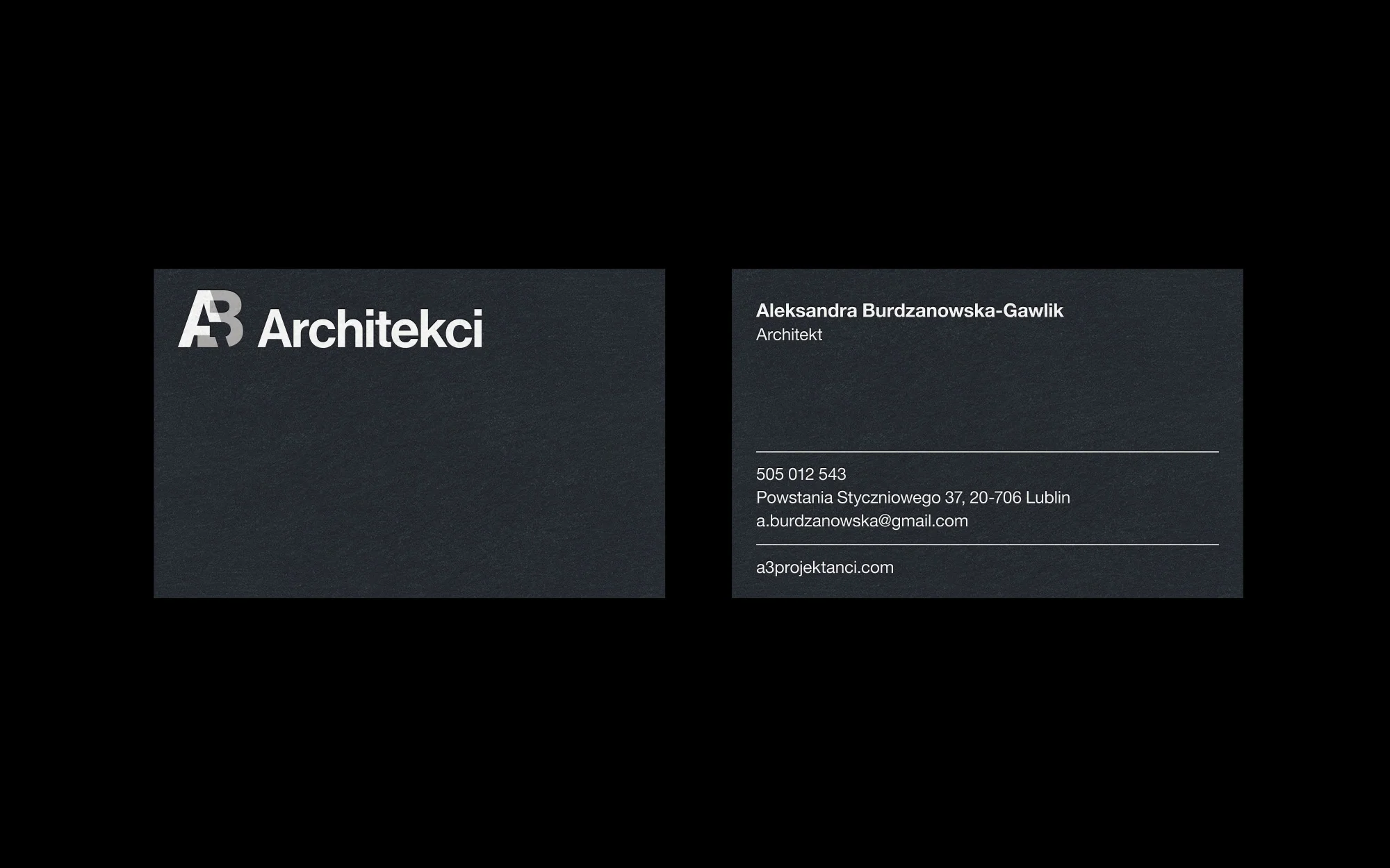
ab_architects_brand_business_card_2.jpg
ab_architects_brand_business_card_3.jpg
wojciech_omiotek_ab_architects_ab_display.jpg
 

The process

Every identity project starts from a research. I asked series of questions to find out more about what Aleksandra is expecting from her new identity system. I looked closely at other identities in the field of architecture and put together a mood board with lots of examples so we could narrow our direction. We quickly defined few major characteristics: simplicity, geometry, stability. Logo had to be minimal and meant to express attention to detail.

wojciech_omiotek_ab_architects_process_3.jpg
wojciech_omiotek_ab_architects_process_4.gif
 

I prepared six logo proposals that were similar in style and aesthetics but focused around AB initials. Aleksandra particularly liked one option, which I developed further and came back with final proposal two weeks later. Logo is a blend of letters ‘A’ and ‘B’ from Helvetica Neue typeface which is also being used for primary typeface for identity system. I tested more than 30 blend and overprint combinations that would make the letters to connect in interesting ways. I picked Helvetica because of accessibility and universal look, it’s highly popular on all computer systems, we wouldn't face a problem of buying expensive typefaces to use on a website and it its great legibility would let Aleksandra to use same typeface on complex plans and drawings even in smallest sizes that would still stay readable. We couldn't really let ourselves to go crazy and fun with this project, identity should express firm’s architectural projects. We decided to keep the colour palette extremely simple, to not distract when presented next to architect’s work. Same rule applied to typography and layout. I based all designs on clean modular grid system that matched nicely with a logo. Other parts of the project were collateral, presentation template, website and examples of use for building site signage system.

wojciech_omiotek_ab_architects_process_2.jpg
wojciech_omiotek_ab_architects_process_1.jpg