The process
What made this project particularly interesting was a fresh approach on traditional model. Bambambi meant to sell and promote postmodern furniture and accessories. Was also designed so selected interior designers could join and offer their services directly through the website. All members of design community would share eclectic, modern style and help to design aspirational spaces through marketplace model.
For inspiration we looked at high end brands from fashion, design and architecture field. We didn’t want for Bambambi to feel like another luxury furniture company. We wanted to express really distinctive style, brand that would feel stylish and fashionable.
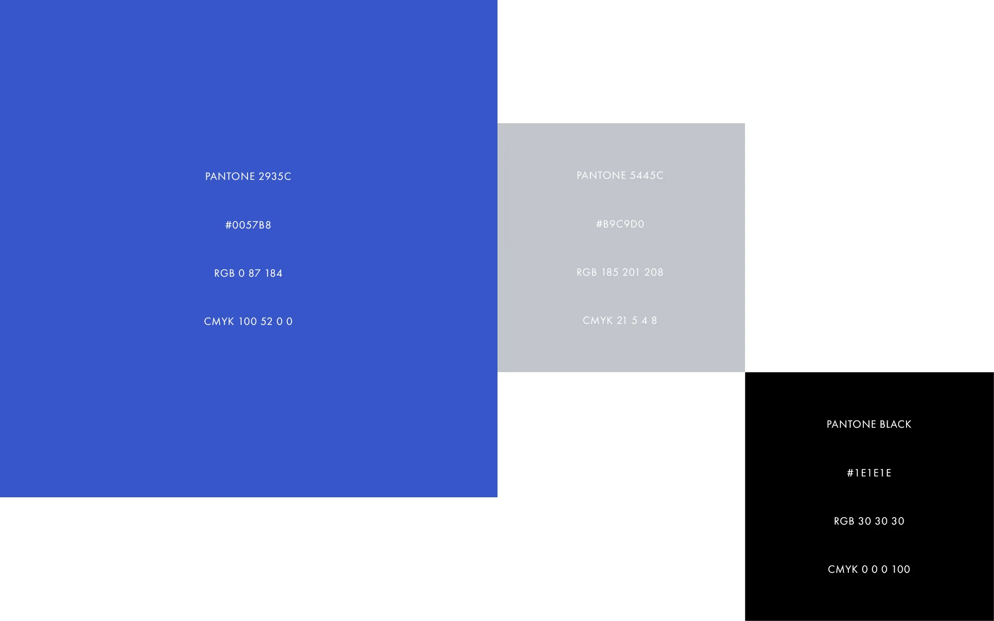
After few weeks of exchanging moodboards and initial ideas I started to craft the brand look. Playful combination of letters in the name gave us opportunity to express the rhythm and experiment with shapes. We based all letters on sharp angles and gave the logo geometric construction to tie in with postmodern style. Construction of letters let us to use them in other brand elements like patterns and iconography system. Considering bambambi wasn't self-explanatory name, we decided to add Online Interiors tagline under the name. I used Futura as primary typeface which works beautifully when paired next to the logotype. Series of expressive patterns support the brand system in backgrounds and has been used widely on social media. Website has simple modular structure based on square grid, which lets to easily stack sections when viewed on mobile devices.