The process
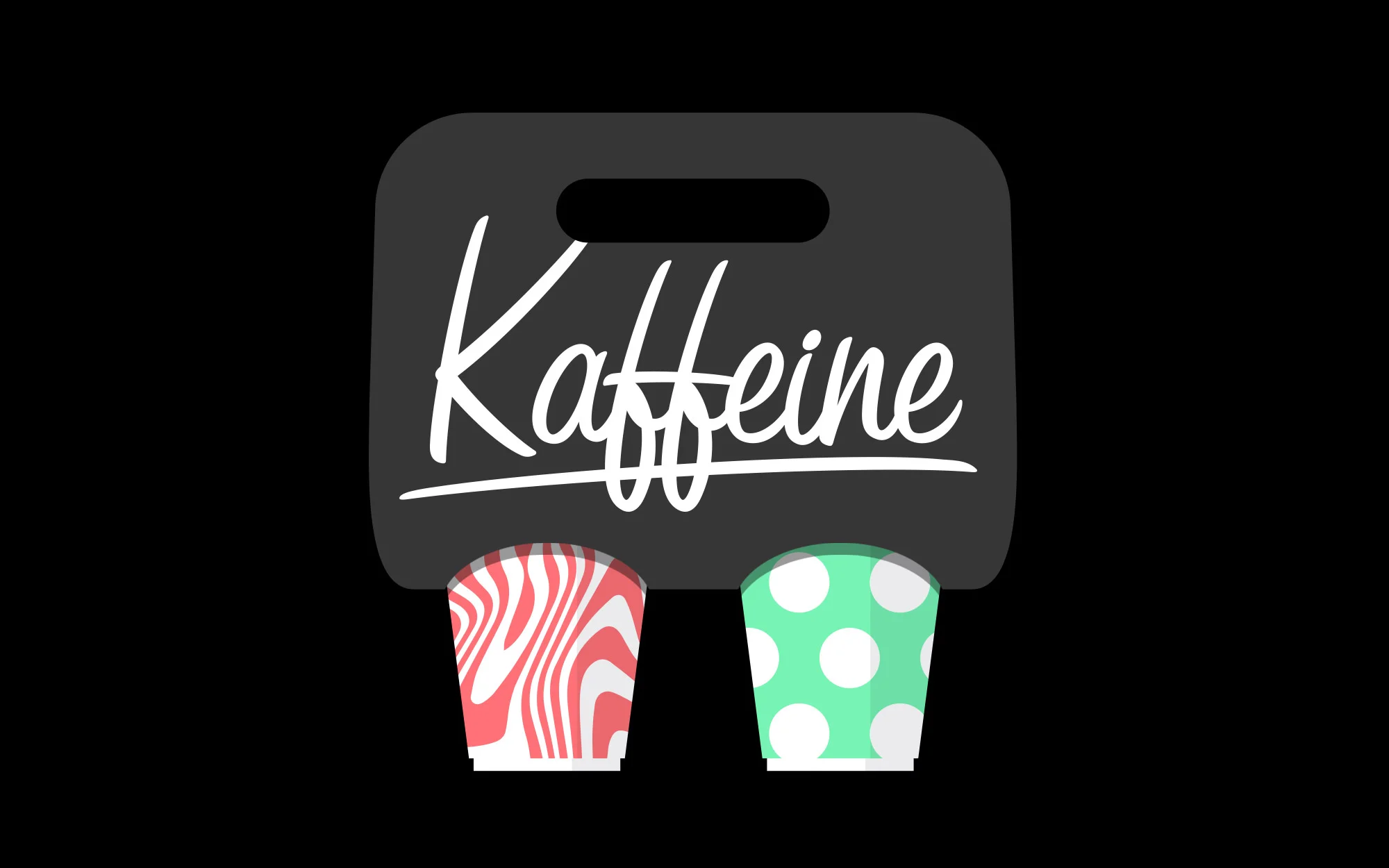
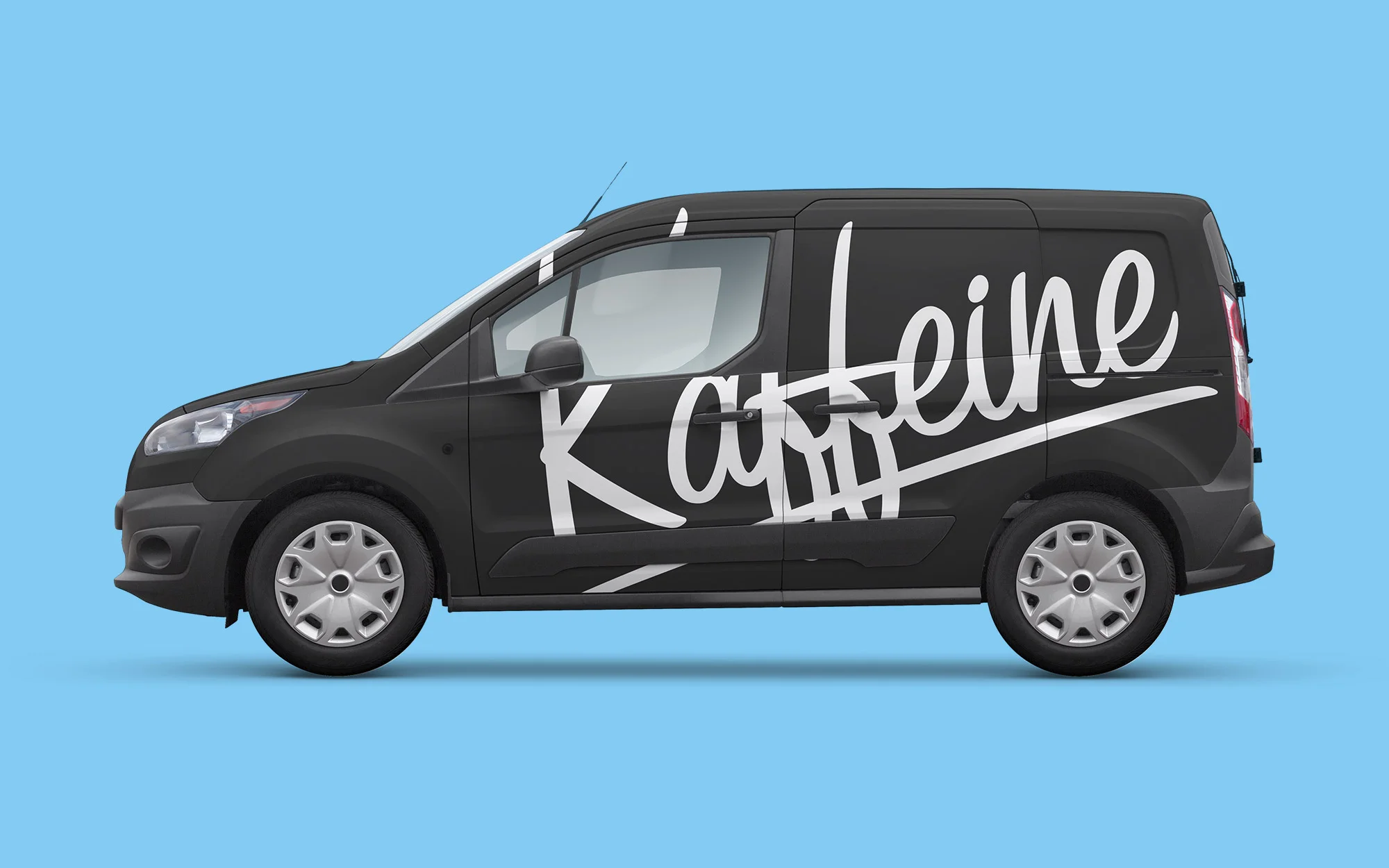
We looked at other coffee shops, they all had this classic, hipster look. It’s not like we didn’t like what we saw, it’s rather the feel of not seeing something special and original convicned us to look in different direction. I wanted to express the energy and brighten peoples lives. There’s no better way to start a day than with a cup of coffee. We had to steal the attention and fill the experience with energy and happiness. I looked at bright colours and bold, expressive elements. I explored few routes for the logo. Final proposal was built around modified script logtype with an underline swash that adds more casual, young look. Primary typeface is Futura, paired with expressive headlines set in Druk.


