Process
Founders approached me to work on the branding concept. Design brief included logo, identity system and website design. The entire process took around three weeks to complete, starting with initial chats and brainstorming, through the design stage to production-ready handover.
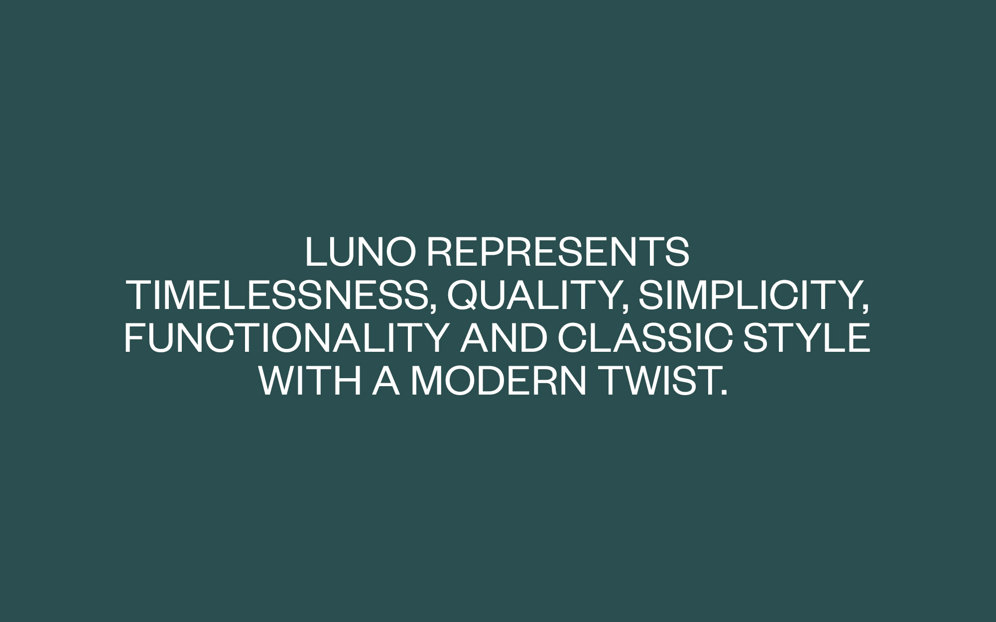
On the market filled with independent eyewear brands, Luno had to make the stand in celebration of practical simplicity and fresh approach. Big part of thinking behind the brand was the element of “modern” meeting “classic”. We decided to keep Luno’s visual communication extremely simple, yet add a surprise effect by boosting it with bold colour and grotesque esthetics. Brand meant to dig into hipster and smart-casual market. We knew that Luno has to express modern coolness with classic craftsmanship which would fit well into fashion scene. Branding didn’t need unnecessary decoration or fussy detailing.
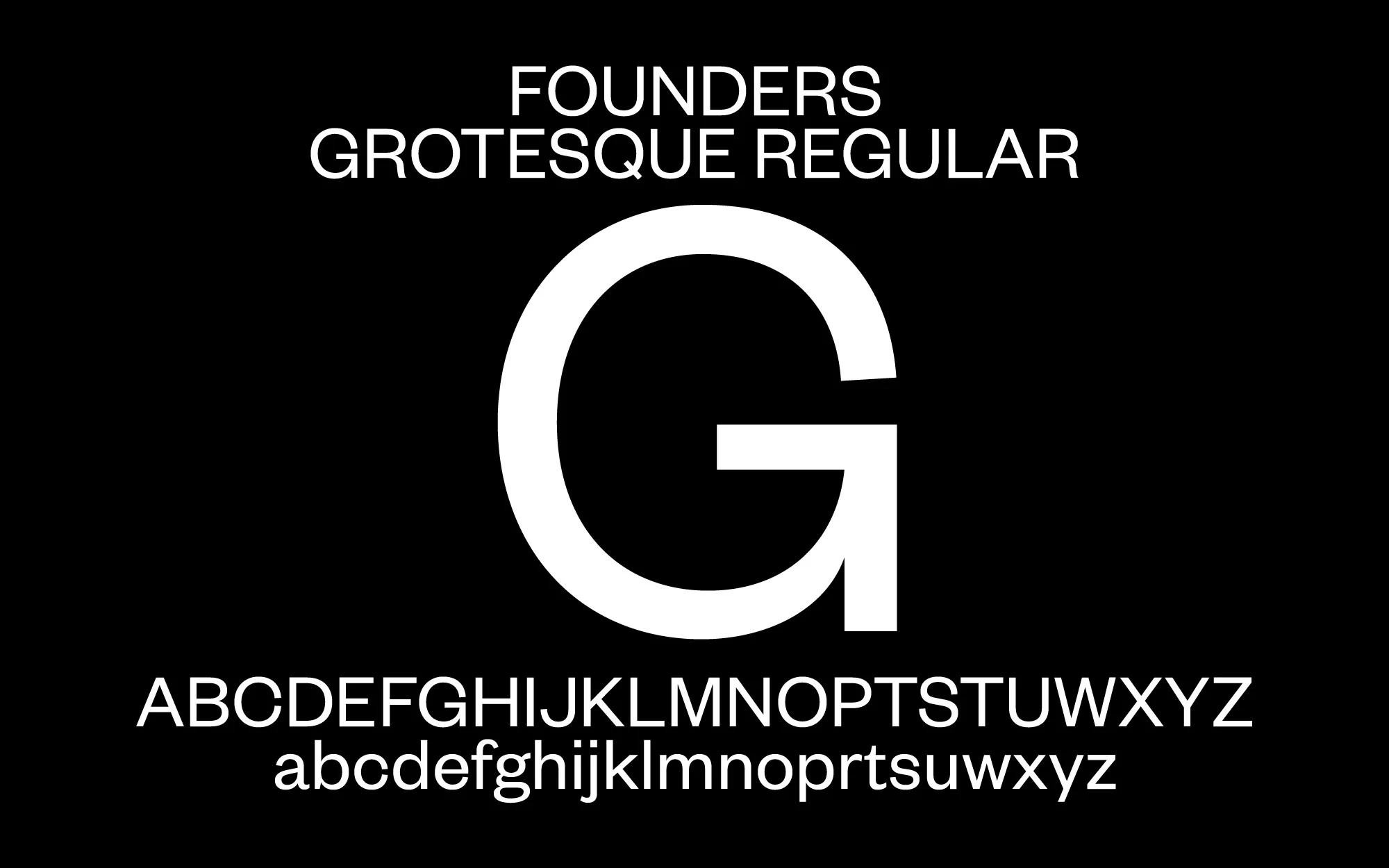
I started my process with looking at tons of inspiration from eyewear industry, then I looked at some of the modern, fashion brands. I started to pull elements from both worlds and built a moodboard that I would later present to the founders. When direction was approved, I moved to the prototype stage. For a colour palette I used a combination of deep classy green, which represents the past, with bold, vibrant orange which represents the future. The clash of two colours looked great on layouts and served well as backgrounds used in the system. Most of all, colours communicated the idea of connection two different styles in time. I used same approach for the typography. I combined modern grotesque typeface Founders Grotesk by Klim Type Foundry with classic JHA Times as secondary typeface. Founders Grotesk works great in big headlines and has a nice bespoke twist to it which doesn't make it to look generic. When paired with serif type from JHA Times, used for subheadlines and body copy, brand would start to have its own voice. Layout system is very simple, almost raw, focused around one and two-column grids which makes it easy to develop on the website and mobile devices. To give the sense of how brand could communicate on social media, I also developed some promotional templates for use on Instagram. Some other concepts included packaging and Thank You card to be send with sunglasses. Project was very fun to work on and founders loved the final result.


